Two Weeks in

wp-1459169196687.jpg
609-Kitchen a work in progress


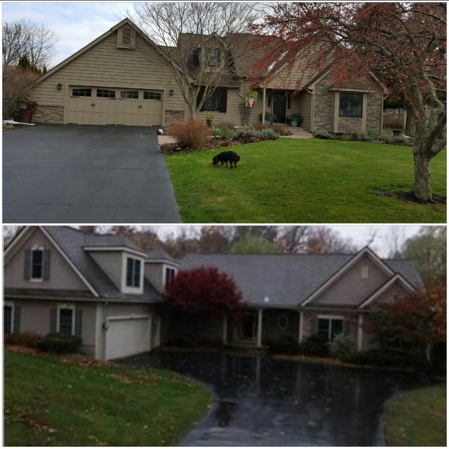
The Kitchen is painted at 609. It feels like home as it’s the color we used at 358. I used 358 as my inspiration in order to make 609 feel instantly like home to our family.  It was our home for 22 years.

image
Inspiration: 358-Kitchen


.

image
I took the RUG from the 358-Livingroom for the 609-Kitchen


image
I took the TABLE from the 358-Dining Room for the 609-Kitchen


image
I took the CLOCK from the 358-Entryway for the 609-Kitchen


image
609-Kitchen a work in progress

We still need to decide on the accent color for the fireplace wall. No, the blue is not staying.
Some considerations are:
1-Cracked Pepper (Office Color)
2-Cream
3-Byzantine Gold  (DR color)
4-Other (Open to ideas)
We also need to switch out the light above the table. I’d like a nice lantern chandelier or maybe some bling. But, that’s the fun part-shopping.

image
Wall Color: Benjamin Moore 132 Color: Bridgewater Tan 1096

I used the same Swatch: Benjamin Moore 132 as I did for my Dining Room project.
-Wall Color: BM:Bridgewater Tan 1096                                                                                                     -Ceiling: Vaspar:Malted Milk 7003-9
I met the Vaspar Rep at Lowe’s and told him I’m a new fan of his Paint Line. I think the larger samples actually won me over. It just makes it easier to decide. You can actually see them.

image
Ceiling and Hallway Color: Vaspar: Malted Milk 7003-9


image
View of 609-Back Hallway 

The Butler’s Pantry is painted part BM Bridgewater Tan and part Vaspar Malted Milk. I wanted to lighten up the Hallway leading to the Laundry Room, Garage and Amanda’s Room. I love it. Amanda’s not a fan of all the Malted Milk. Oh well. There is always a critic.

image
609-Kitchen a  work in progress

The kitchen will be lovely once the blue countertops are replaced and the pulls on the cupboards are updated.  Rome wasn’t built in a day. It’s all going to come together.

I’m pooped so I’m relaxing in the Sunroom. I haven’t painted it yet;  but, I decided to start setting it up anyway. I didn’t hang the picture yet either; that’s Michael’s Department. I’m going to leave the Sunroom a quiet color. Perhaps more Vaspar: Malted Milk or I might continue with BM: Bridgewater Tan or take Amanda’s advice and paint it BM: Oakwood Manor. I’m using BM: Oakwood Manor in the Hallway. I hope to install a brick floor or possibly just replace the carpet with sisal carpeting in the Sunroom as well.

image
609-Sunroom a work in progress

The furniture is mostly from the 358 Family Room. However, I stole the trunk from Amanda’s Bedroom. Shhh, don’t tell her.

image
I took the sofa from the 358-Family Room for 609-Sunroom


image
I took the Bookshelves and the Palm Picture from the 358-Family Room for the 609-Sunroom

The view is lovely and the sounds of the birds and the rooster crowing is heavenly.

image
609-Sunroom View

Austin told us the Sunroom is his favorite space when he visits and that he’d be disappointed if there was a tv. I agree. Sometimes you need a spot for quiet contemplation and reading. This is that perfect spot. Michael and Amanda don’t agree; they’d like a TV in every room. What are your thoughts on the matter?

Happy Monday,
EnJOY-Trisha

Please Pass the Pepper

image

The office got painted.
We chose Behr Cracked Pepper.
I love, love, love it!!!

I find Behr Cracked Pepper is simular to Sherwin Williams Peppercorn both are a great dramatic (dark gray-black) colors.

image

I love the color for a masculine office. It looks terrific with the dark wood cabinetry and floors. I also love the rich dark color when you are out of the room peeking in from a lighter quieter color hallway or livingroom, as it gives you drama.
Any anyone who knows me well knows I love drama, in decorating.
A little drama goes a long way. My rule is: Be conservative in your main rooms; but daring in your secondary rooms.

I also used it at 358 in a basement media room on walls, trim and ceiling with a light wood floor and with white cabinets. It looked terrific there as well. Wonderful for a media room great to view a TV night or day.

image

Before Picture:
The former owner’s wallpaper.

image

During Picture:
Oil-Based Kilz covers the wallpaper. It says odorless; but, that is a lie.
 

image

After Picture:

Yes, you can use Latex Paint over Oil-Based Kilz. Ironic as the Benjamin Moore website advised Oil-Based Paint be used and the BM Paint guy told me I had to use latex. You can’t use Oil-Based wallpaper in NYS. Only Oil-based Semi Gloss for Trim is available.

image

All I could think of was the Burgermeister Meisterburger
‘There will be no toys for Christmas.’ I was so excited for Oil-Based Paint as everything I read said my walls would be rich and wonderful with oil-based wall paint over the kilz, over the wallpaper….Damn NYS you robbed me of fabulous walls.

It’s just paint!

We said goodbye to the former owner’s Pepto Pink Diningroom walls and hello to:
Benjamin Moore’s Brazilian Gold.

image

It’s amazing how paint can transform a room. We continued with the ceiling color that we used in the Guest Bedrooms:

image

View of Guest Room
Walls and Ceiling both in: Vaspar’s Malted Milk.

image

Before: Diningroom

image

:

After: Diningroom
  

image

Next is saying goodbye to the pink carpet and hello to a beautiful brick herringbone floor.

Too pooped to putter

Things have been hectic around here. We closed on 609 (the new house) ten days ago and listed 358 (the old house) for sale yesterday.

In ten(10) days time we have gotten quite a lot accomplished in-between our work schedules:

●We moved the majority of our ‘stuff’ from 358 just leaving furniture staged in each room and put most of it away at 609.
●We cleaned the entire house at 609 scrubbing away dirt and debris as well as 358 to get it ready for showings.
●We replaced the brass outdoor lighting fixtures at 609 to oil-rubbed bronze.

image

●We replaced the brass doorknobs at 609 to oil-rubbed bronze.

image

●We are in the process of switching out all the old sliding dimmer switches at 609 to new ones that actually work.

image

●We hired a crew (three-man job) to apply the Oil-Based Kilz over the wallpaper at 609. They will return on Saturday to begin painting.

image

●We hired our dear friend, Don and his brother, Jimmy to fix the drywall in the cathedral ceiling of the living room at 609.
●Our appliances were installed on Saturday by Orville’s at 609; but, we are waiting for the gas to be turned on today for the stove top.

image

●My nephew, Aaron came and painted the two guestrooms at 609 (ceilings and walls) a clean fresh cream. Vaspar Malted Milk. Yes, I used Vaspar! I was plesently surprised. It looks marvelous.

image

●We got Chris, from Hidden Valley over to look at the property to access how much $$$ yard clean-up will be at 609.

image

●Time Warner got the internet working; after two attempts and 3 seperate workers came to 609. We still are waiting for them to come bury the cable they had to run along the driveway.

image

●Dish Network installed the new dish so Amanda is happily binging on Netflix: The Office after a long day at the Salon.

image

●I set up the bookshelves in the livingroom with all my treasures.
Maxi loves her new spot. I was able to store our collection of VHS and DVD in the cupboards below, alphabetized of course!

image

●My sister, Debi helped me out by putting the contact paper in the many kitchen cupboards. Cassie, Aaron’s girlfriend did our first grocery run.
●The first day on the market for 358 proved much success. There were 22 showings and 5 offers!

image

All in all I’d say things are plugging along smoothly.
I’ll give another update soon.
InJOY-Trisha

It’s not BLACK and WHITE

Choosing a paint color seems like an easy decision; yet, with all the many choices ie:150 Benjamin Moore Whites alone. Finding that perfect color becomes very daunting and slightly overwhelming.

Here is a little advice for:
How I narrow down my paint choices.

(1) Choose a BRAND:
Select a brand and stay with it. Are you a fan of Sherwin Williams, Behr, Farrow&Ball, Benjamin Moore, or is there another brand that you prefer? Stick with the brand you prefer. For me it’s hands down Benjamin Moore.

(2) Go on a SEARCH:
Search the Internet for: Color Suggestions in your brand. ie: Benjamin Moore Whites. I recommend visual inspiration via: Pinterest, Houzz, or various Blogsites (see sources below). Furthermore, once you narrow down your search you can search that particular color name that you love ie: BM White Dove and you’ll usually find gobs of photos.

(3) Know your DIRECTION:
You have to remember that the direction a room faces plays an important role in how that color will look. Is it a North-South-East-West facing room?
See my earlier post for more details: THINK DIRECTION WHEN CHOOSING PAINT COLORS

(4) What’s your EXPOSURE?
With that being said, also remember the strength of that Natural Light. Are you in the North where the sky is often gray or in the South where sunshine is aplenty? There is a big difference that exposure will bring to the overall presence of the room.

(5) Room USAGE:
Is this a room where you’ll be entertaining in the evening?  For example: In your Dining Room you’ll want a dramatic effect for that evening light. If you want a color that works in the daytime, you’ll choose differently. All these things play an important role in what color you’ll choose.

(6) What’s your STYLE?:
●What look are you aiming for: •Classic
•Traditional
•Country
•Modern
●Do you like to:
•Play it safe
•Go dramatic (Are you a drama queen?)
●Do you follow the current trends:
•White
•Gray
•Taupe
●Do you like Soft or Bold colors:
•Blue, Pink, Yellow, Green
•Purple, Orange, Red
(That voice from Jack Nicholas in The Shining always plays in my mind when I say “Red Room” I don’t know why.)

If you follow these Six Easy Steps it will help guide you to finding that just right hue for your walls.

Next up: We will tackle the trim and the ceiling paint selections.
The fun has just begun!

EnJOY-Trisha

Sources: http://www.
(1)laurelberninteriors.com
Blog post: The Only Six White Paint Trim Colors You’ll Need
(2)livelovediy.com
(3)southern living, editor in chief,
lindsay bierman
(4)benjaminmoore.com
(5)sherwinwilliams.com
(6)mariakillam.com
(7)pinterest
(8)houzz

Oh Crap, what did we do!

We are getting down to the wire and we’re beginning to feel the pressure.

It’s a little unsettling:
•transforming your home to get ready to sell
•getting everything packed up to move
•working on projects in your down time
•planning/scheduling all your future jobs in the next house
•trying to plan around a closing date that keeps changing

So, this Saturday Morning was the day we planned to paint the basement stairwell and get a coat of Primer on the powderroom walls.

I didn’t want to buy my favorite Benjamin Moore $50.00/gallon paint for the stairwell. So, I sent Michael to get a nice Glidden beige Paint. Bob Villa likes it. Well, he found a can of Behr on the sale rack for $9.00 that someone had mixed and refused. The color was a little shocking in the can, almost the color of Maxi’s deposits; but, sometimes the color looks better on the wall.

So, Michael donned his t-shirt and boxers, that’s his painting uniform, go figure. He actually purchased blue painters tape (a six-pack). This is quite a big deal as, Michael is  fast-paced and often begins his projects before getting all the necessary materials.

I suggested:  “Just paint a little and we’ll decide. I’ll be right back.” When, I came back one entire wall and 1/2 the ceiling was done. GASP.

Now, we have gold walls with black trim and green carpet. Yikes! It sounds as awlful as it looks. It was supposed to transition from the main floor beige to the basement peppercorn.

Maybe I can use some pictures to enhance it.

image
Before
image
After

Let’s Get Help

screenshot_2016-03-03-09-44-59.pngAs we began on our adventure transforming the house where ‘Laura Ashley threw-up’; we decided we needed a professional’s opinion. Not that kind of professional; although it might be a good idea; anyone know of a good doctor? We called in a Handyman, a Wallpaper-Paint Pro.

He took out his handy knife and unscrewed a light switch from the wall and lifted up a piece of the wallpaper exposing the wall below. What do you think he saw? The unexpected. “Well, this was a professional job, the seams are perfect. The only problem is they installed it right over the drywall without it being sanded or primed. See how the drywall paper is buckled in some spots? This is quite a job to remove and it will be a challenge to remove it without destroying the drywall.”

So, as he left to add up ‘cha-ching’, how many hours he was going to take to complete just one of many, many rooms and how much it would cost… I grew impatient, overwhelmed, saddened, frustrated and decided to consult my personal handyman, the internet.

I discovered rather than removing all the wallpaper that was going to cause tearing of the drywall paper and require mudding, sanding, priming, painting, repeat I could keep it. No, I didn’t suddenly fall in love with the look of the 80’s floral, striped and bordered look. I could leave it, the wallpaper would actually protect the drywall from getting further damage and prepare it to be painted.

THE STEPS:
•FIX any loose pieces of wallpaper with adhesive
•CAULK where the paper meets the floor and ceiling
•COVER textured paper with a thin coat of joint compound
•SAND the seams, gently
•APPLY a coat of an Oil-Based Primer to the entire surface
•PAINT two coats of Oil-Based Paint
•SMILE breathe a sigh of relief

Yes, I said Oil-Based not Latex; as the walls cannot have a water-based primer or paint. The moisture in the water-based paint can sometimes loosen the wallpaper glue, causing bubbles or peeling.

Sourceswww: benjaminmoore.com,  YouTube:jonpetersart&home.com,
YouTube:thisoldhouse.com
YouTube:monkeysee.com

Before and The Inspiration

The Plan:

Every good thing needs a plan.
Every good plan needs an inspiration.

Here is my visual inspiration.
My hope in transforming the Foreclosure House into our families next Home.

The bones are great.
The light is good.

Think Direction when Choosing Paint Colors

Metamerism occurs when colors appear to change under different light conditions.

What direction does your room face?
North: indirect, cool light                                                                                                                               East: brightest before noon
South: can be intense at midday, lasts the longest
West: brightest light after noon

How does direction affect the light?
North: cooler blueish, gray tinge
East: warm and yellow bright
South:  warm orange-yellow
West: warm orange-red

How does that light affect the paint?
North: causes dark hues to appear darker;
causes light hues to appear subdude
East: to enhance the light: warm pinks, yellow, or white
to subdued the light: cool blue or green
South: dark colors appear brighter as it adds yellow to a color
white can leave the room washed out, Mid-tones look best day and night
West: adds warmth and an orange tinge to color

Best Color Options:
North: warm, beige, cream, yellow, pale pink and coral
East: pale colors look beautiful, pink, coral, yellow, blue, green
South: warm, earthy hues, blue, green, brown
West: green, cream, reds

Brand Suggestions:
Benjamin Moore
North:
(Yellow)Vibrant Barley CC-180
(Cream) Flurry CC-100, Barley CC-180, Buttermilk 919
(Pinks) Pink Moire CC-158
(Corals) Tofino Sunset CC-156
East:
(Warms) Pink Bliss 2093-70, Cloud White OC-130, Snowfall white OC-118, Milkyway OC-110
(Cools) Blue Bonnet 2050-70
South:
(Mid-tone) Lavender Lipstick 20752-50
(Greens) Meadowlands Green 2036-40, Winter Green 2045-60,
(Blues) Serenity 2055-60
(Brown) Rich Clay Brown 2164-30
West:
(Green) Adam Green 2037-40, Green with Envy 2036-30
(Cream) Mellow Yellow 2020-50, Marble White OC-34
(Red) Warm Comfort 2010-20

Sourceswww: benjaminmoore.com, pegasuslighting.com, mariakillam.com, apartmenttherapy.com, angelabuntcreative.com, houselogic.com, 10rooms.blogspot.com, housebeautifil.com, farrow-ball.com