2018 has brought with it an Empty Nest. As our youngest, Amanda moved into her 1st apartment, we now are faced with the reality that a new chapter awaits us all. Now, after 30+ years of marriage and 23+ years of parenting we have the opportunity to look at each other in a whole new light. It’s bittersweet that we are transforming Amanda’s Suite into a Guest Suite.
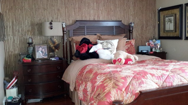
THIS IS A BEFORE PICTURE: The Former Owner’s Patriotic Theme

TO BEGIN: When we moved in Amanda had chosen to replace the carpet with a dark engineered wood. She also elected to paint the North-facing room a warm, neutral beige wall color and cream trim. We kept that as is. Regretfully, I can’t for the life of me find a picture of the Suite with Amanda’s furniture. She had it decorated it in a Tommy Bahama style: Dark wood, bamboo, palm tree prints. The best I can find is a picture of her bedroom from the old house.
In lieu of shopping, we challenged ourselves to see if we could do it with what we had. So, we went through the house and picked and plucked some of our favorite items for the newly empty space. Here is what we have so far. We chose Neutrals: Beige, Cream, Gray

We mixed in naturals: Wood mixed with upholstered pieces and accented by woven sisal textures and a touch of rustic iron.

It’s still a work in progress; but, hopefully the result will be a warm and welcome nest for our visitors: family, friends and our adult children who want to come for an overnight.
This was my adapted from my Instagram post. Feel free to follow me. I am always posting Madi’s and my adventures.
In addition, I am including my 7 Helpful Tips in Decorating a Space:
1. Be inspired. This is where my inspiration came from. Madi and I love to take our daily nature walks here.

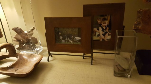
2. Display your treasures. On the table next to the bed, in the glass vases, are the rocks and driftwood that I gathered on our walks. I can continue to add to my collection.

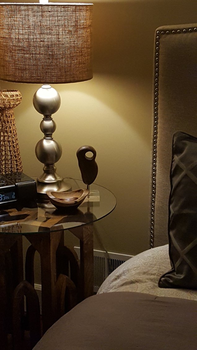
3. Layer on the textures. I like all the geometric details in the carpets and upholstery. I especially like paring them with textural items like the woven sisal pieces.

The smooth woods are a nice contrast to the woven which lends another layer.

4. Don’t forget the details. I love the nailhead trim on the linen headboard. I also like mixing bed linens. White sheets are a given. By layering a muted paisley duvet with a pewter and sterling geometric comforter it makes a nice contrast.

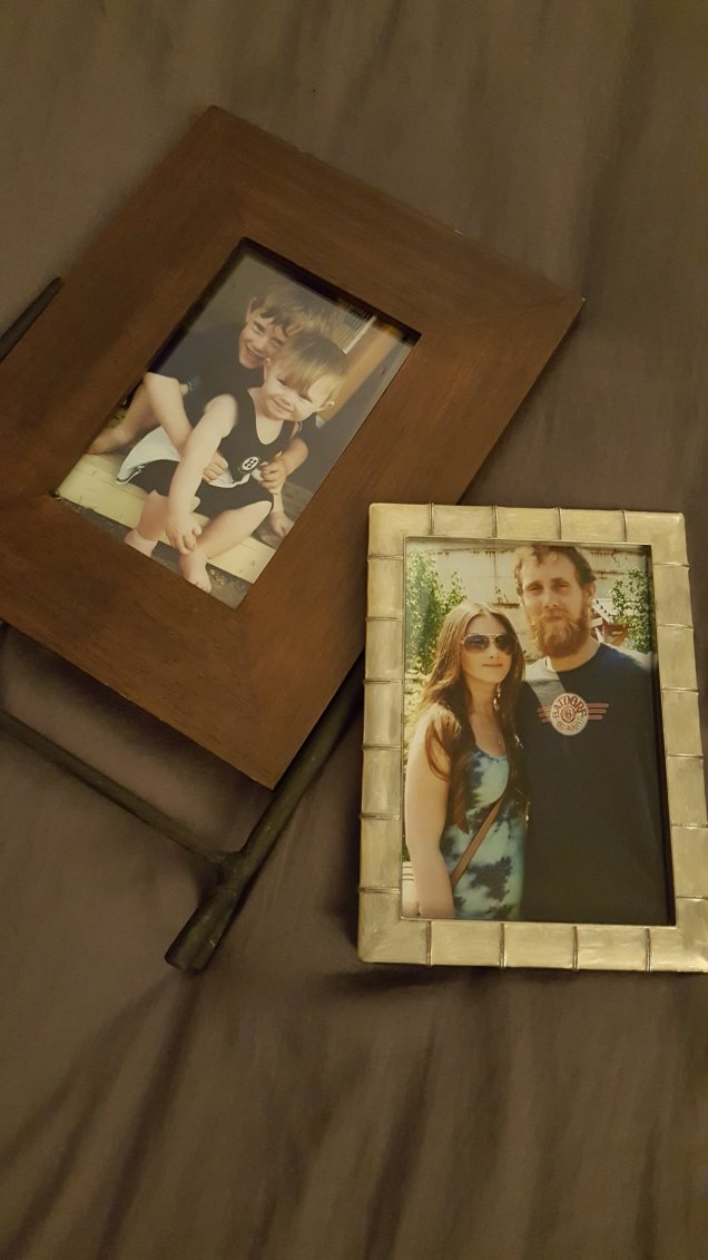
Adding touches of family photos help to make the Guest Suite homey. I added two favorite photos of my kids, then and now. Using contrasting frames like the primative wood/iron and elegant silver makes it more interesting.
5. Fill the room with things you love. If you surround a room with all those things that make you smile it will make your guests feel welcome.
6. Be patient. Don’t rush to complete the room all at once. Take time to find all the right pieces. I still have to find a few more pieces. (1)Once the beach thaws out, I’d like to find a large piece of driftwood to make into a shelf under the mounted t.v. (2)I have a gray bench in the dormer entry that I need to mount a mirror and hooks by. (3)I am also hoping to paint two large canvases for either side of the closet door. Stay tuned for that.
7. There is always another project. The en suite Guest Bathroom is in need of a face lift. We have a very tight budget for the redo. Sometimes, a shoe string budget inspires the most creative fix. I will post that just as soon as I figure it out. In the meantime, I am hoping to post some of the Before/After Projects that we have been working on.

Well, I hope that gives you some inspiration for your project.
InJOY-Trisha


